#react sidebar menu
Explore tagged Tumblr posts
Visit Tumblr Blog
Explore Tumblr blogs with no restrictions, modern design and the best experience.
Last Seen Tumblr Blogs


Fun Fact
In 2020, 44% of users from Denmark used Tumblr daily.
Video
youtube
Create a sidebar with submenu using ReactJS | Devhubspot
0 notes
Video
youtube
Create a sidebar with submenu using ReactJS | Devhubspot
0 notes
Text
Three Strands Part II
Going more for the 'future eventualities' angle, @shinkaneweek! Already up on FF.net and AO3
part ii: proactive
Truthfully, she was aware of the gossip.
The unit usually hushed when Akane entered the workroom, but she caught the fragments of conversation anyway. The Enforcers were talking about them, how natural they were in their cover identities and that she spent her lunch breaks outside, presumably with him.
“Cut it out, it isn’t appropriate to speculate.” Kei had attempted to stop the discussion, for which she sent a grateful glance. Arata’s tactic was to change subjects, though from what Hinakawa told her, he wasn’t above joining in sometimes. And Mika would thunderously order everyone to resume working, with a searing glare.
The ring was not helping, yet she couldn’t bring herself to remove it. She was still getting accustomed to the weight, she said to those who asked. Still, the design was very much to her liking. She had singled it out in the store and while the receipt was backdated, he had slid it on.
Kougami was so serious and focused, but his voice was gentle. “Fits okay?”
“Perfectly. Thank you.” Akane hoped she sounded calm. She was about to invite him for dinner when he had a call, a summons to interrogation. His gaze lingered a second on the ring, just until he had to depart. Every time they met, the sense of pride intensified.
At this point, she wondered if she should be bolder. Their meetings were innocuous, never progressing further than shared meals and drinks. Their history was already complicated enough; for once, they could sit and talk like normal people. As they were now, they were on equal footing. But she had long accepted that nobody else could ever compare, so the slow pace was beginning to annoy her, just a little.
Perhaps, after the case was over, she’d continue to wear the ring and see how he’d react.
***
Yanase Juria made her move first.
They had finished the day’s session, deciding the menu and table settings for a dinner that would never happen, when heels clicked in their direction. Akane instantly recognized her. The woman’s appearance was as polished as her online photo, except marred by a deep frown, aimed towards whoever she was contacting via an earpiece.
“Fine. Do whatever you want.” She huffed. Then, she spotted them and marched over with a practiced smile. She introduced herself, along with the sentiment that there was no better place for their impending wedding. Something in her eyes was off, a glassy effect that seemed to study their faces. “I heard you settled on your food and beverage plan. What’s next for you?”
Akane evenly responded. “It’s at the boutique, but we’re going to our dress and suit tailoring, since we’re changing for the reception.”
Purely for research, she had browsed catalogues. Her false identity conveniently had a style sense like her own: clean lines, modest cuts, and feminine flair. Then, the lingerie popped in its own sidebar, and she was clicking before she could stop herself. After a while, she broke out of it, perusing the men’s options instead. Black was his color, but she was curious if he was willing to wear anything else. She quickly realized Kougami would look devastatingly good regardless, then chided herself for how late she’d stayed awake and shut down her computer.
Yanase gave a light sigh. “And regrettably, you’ll have to use your room when you do. We’re working on some repairs, access will be limited to a few areas on this floor. But don’t worry, I’m quite proud of the honeymoon suites.”
“You’re very generous. We appreciate it.”
Once they were in the car, Kougami noted. “She has a fox’s intuition, but her arrogance will be her undoing. We’ll have to catch her quickly.”
“Yes. She might have an additional implant to her corrective lenses. Presentation is important to her; she enjoys knowing if she’s superior to others.”
“I’ll add to your profiling. She lacks trust in her subordinates, so she’ll be paranoid about the other members like her.”
“And she feels insecure, which is why she bought the building in the first place, to declare that she’ll succeed where the previous didn’t.”
“Exactly. You’ve grasped her thought process, not that I’m surprised. You understand human nature incredibly well, it’s your strength. It’s what I admire about you.” He was regarding her in a way that was occurring more frequently, ever since she was released. Many days of tears and empty hours, all rendered to a fading nightmare at the sight of his relieved expression.
She tried not to blush. “Well…my fiancé is an unfair man.”
There it was, the flicker of embarrassment, the break in his demeanor. But instead of awkwardly switching subjects or answering the cue of an unwelcome interruption, he tapped his index finger under her chin. Her eyes flew up, and he smirked. “And my future wife likes to tease.”
Future wife. Those words continued to echo in her mind, for the rest of the drive home. Everyone else in Unit 1 had been stunned that Kougami had volunteered, clamoring that he always resorted to brute force and provocation, he wasn’t suited to go undercover at all. But really, she was the one who couldn’t stay in character.
***
The raid was scheduled for the end of the week. Yanase had no documented proof of anything more enhancing her vision, but that didn’t rule out the possibility of her realizing they had Holos. Arata and Kei had conducted a thorough investigation on their end as well, finding suspicious transactions and investments. Ginoza relayed what SAD had uncovered, the messier details on how Yanase was connected to ports with less stringent oversight. Then, entry and exit points in Yume were delineated, the roles assigned to ensure a successful arrest.
Ginoza turned the simulated model of the hotel. “And my post will be here, blocking off the west exit. Kougami, you’ll enter through the front with Tsunemori, in your usual disguises.”
“We’ll have Dominators.” She explained. “Yume resides in our jurisdiction, and temporary access was granted to you.”
“And no, we won’t equip you with other weapons.” Ginoza shook his head.
“I wasn’t going to ask because I don’t need them.” Kougami countered. “I’ll keep my partner safe.”
During the mission gone awry in Dejima, he had embraced her differently than in Shambala. He had embraced her, his large hand cupping her head and his body pressed to hers. The solid heat of him between her thighs was an intrusive memory, and she used to dislike how it’d inconveniently rush to the forefront of her mind or drain sleep from her restless nights. Lately though, she wasn’t resenting it.
“We’ll protect each other.” She corrected, and was rewarded by the approving fondness in his eyes.
18 notes
·
View notes
Text
Level Up Your Prototypes - A How-To Guide to Figma Variables
Hey design aficionados! Ever feel like your Figma prototypes are a bit... static? Want to inject more dynamism, more life into your user flows without getting bogged down in endless duplicated screens? Well, buckle up, buttercups, because Figma Variables are here to change the prototyping game. They're not just a fancy new feature; they're a fundamental shift towards smarter, more efficient, and ultimately more powerful interactive prototypes.
Think of variables as the secret sauce to creating prototypes that truly react to user input. Instead of manually linking every single state change, you can define dynamic values that update across your design based on user interactions. This means less tedious work for you and a more realistic, engaging experience for anyone testing your designs. Ready to dive in and unlock a new level of prototyping prowess? Let's get started!
Understanding the Basics: What Exactly Are Figma Variables?
At their core, Figma Variables allow you to define and manage reusable values across your design file. These values can represent anything from colors and numbers to strings of text and even boolean (true/false) states. The real magic happens when you connect these variables to your prototype interactions.
There are four main types of variables in Figma:
Color: Perfect for managing your brand palette and creating dynamic theme switching in your prototypes.
Number: Ideal for representing numerical values like quantities, prices, or even the progress of an animation.
String: Use these for dynamic text content, such as usernames, messages, or form input values.
Boolean: These are your on/off switches, perfect for toggling visibility, enabling/disabling features, or managing different states.
Step-by-Step: Implementing Variables in Your Prototypes
Okay, enough theory. Let's get our hands dirty and see how to actually use these bad boys.
Step 1: Creating Your Variables
First things first, you need to define the variables you want to use. Head over to the "Local Variables" panel (usually found in the left sidebar, or you can access it via the "View" menu). Click the "+" icon to create a new variable. You'll be prompted to choose the type of variable you want to create (Color, Number, String, or Boolean).
Give your variable a descriptive name (e.g., "primary-color," "item-count," "username," "is-modal-open"). This will make it much easier to manage them later. For Color variables, you'll select the initial color value. For Number variables, you'll set a starting number. For String variables, you'll enter initial text. And for Boolean variables, you'll set the initial state (True or False).
Step 2: Linking Variables to Design Elements
Now that you've created your variables, it's time to connect them to the elements in your design. Select the layer you want to make dynamic. In the right-hand Properties panel, you'll see a small "variable" icon next to properties that can be linked (like Fill color, Text content, Opacity, etc.). Click this icon and choose the variable you want to connect.
For example, if you created a "primary-color" variable, you can link it to the fill color of your primary button. If you have an "item-count" variable, you can link it to the text layer displaying the number of items in a cart. For a "is-modal-open" boolean, you can link it to the opacity or visibility of a modal group.
Step 3: Creating Interactive Prototypes with Variable Actions
This is where the real magic happens! In Prototype mode, when you define an interaction (like a button click), you now have a new action type available: "Set variable."
Select the interaction trigger (e.g., "On click"). In the Actions section, click the "+" icon and choose "Set variable." Here, you'll select the variable you want to modify and define the new value it should take based on the interaction.
Let's say you have an "item-count" number variable. When a user clicks an "Add to Cart" button, you can set the "item-count" variable to its current value + 1. This single action will automatically update any text layers linked to this variable across your entire prototype!
Similarly, if you have an "is-modal-open" boolean variable, clicking a button to open a modal would "Set variable" to True, and clicking a close button would "Set variable" to False. You can then link the opacity or visibility of the modal group to this boolean variable, creating a dynamic show/hide effect.
Examples in Action: Boosting Your Prototyping Efficiency
Let's look at some practical examples of how Figma Variables can supercharge your prototyping efficiency:
Dynamic Form Input: Instead of creating separate screens for each character typed in a form field, link a String variable to the text layer. On each "Key press" interaction, use the "Set variable" action to append the typed character to the variable.
Quantity Counters: For e-commerce prototypes, use a Number variable to track the quantity of items. Clicking "+" would increment the variable, and clicking "-" would decrement it, automatically updating the displayed quantity.
Theme Switching: Define Color variables for your light and dark modes. A toggle switch can then use a Boolean variable to determine which set of color variables is applied to your design elements.
Progress Indicators: Link a Number variable to the width or fill of a progress bar. User actions can then update this variable, visually showing the progress of a task.
Toggling Features: Use Boolean variables to enable or disable different features in your prototype based on user interactions or simulated settings.
The Benefits: Why Embrace Figma Variables?
Using Figma Variables for your interactive prototypes offers a plethora of advantages:
Increased Efficiency: Reduce the number of screens you need to create and manage, saving you valuable time and effort.
More Realistic Prototypes: Create more dynamic and engaging user experiences that better reflect the behavior of a real application.
Easier Iteration: Making changes to dynamic elements becomes much simpler. Update a variable once, and the changes propagate throughout your prototype.
Improved Collaboration: Variables provide a more structured and maintainable way to manage dynamic content, making it easier for teams to understand and work on prototypes.
Enhanced User Testing: More realistic prototypes lead to more insightful feedback during user testing sessions.
Getting Started and Further Exploration
If you're new to Figma Variables, start with simple use cases like dynamic button states or basic toggles. As you become more comfortable, you can explore more complex interactions and combine different variable types to create truly sophisticated prototypes.
Figma's own documentation and community resources are excellent places to delve deeper into the advanced capabilities of variables. Experiment, play around, and don't be afraid to break things! The more you explore, the more you'll discover the immense power and flexibility that Figma Variables bring to the world of UI/UX design tools.
So, ditch the static screens and embrace the dynamism of Figma Variables. It's time to level up your prototyping game and create truly smart, interactive experiences that will wow your clients and users alike. Happy prototyping!
0 notes
Text
Week 9 Reflection – DES303
Theme: Accessibility, Feedback, and Iterative Redesign
What I Did This Week
Analysing user feedback and turning it into useful design enhancements for Pulse: Freedom in Motion was the focus of this week. Earlier, I held a targeted user feedback session where participants provided input on four main areas: content, navigation, accessibility, and visual design. I started redesigning the app's main features based on their feedback, giving accessibility and clarity top priority. My objective was to make the app more inclusive and user-friendly while improving the user experience based on practical insights.

Feelings: From Uncertainty to Confidence
At first, I experienced a mixture of curiosity and anxiety. There was a subdued fear of how people would react to something I had spent so much time creating. But after I started reading their thoughts and recommendations, I felt inspired and reassured. Not only was the feedback critical, but it was also involved and constructive. The process felt collaborative because it was clear that people were interested in the app and wanted it to be successful. My perspective changed as a result of the experience from supporting design decisions to supporting iterative growth.

Evaluation: What Feedback Revealed
The comments pointed out both areas that needed improvement and areas that were strong. The idea of integrating progress tracking, mental health, and movement was well received by users. The general idea and variety of dance content were well received. But there were three main areas of worry:
The homepage's visual clutter made it difficult to concentrate.
For mobile-first interaction, sidebar navigation felt strange.
The sense of ownership was lowered by the lack of personalisation options.
More importantly, several users brought up accessibility issues, confirming the importance of going beyond superficial inclusion. More careful design was required in the areas of button sizes, colour contrast, screen reader support, and visual hierarchy.

Analysis: Insights from Redesigning with Empathy
Replacing the sidebar menu with a bottom navigation bar was one of the best ideas. This design decision is supported by research, as bottom navigation is more frequently utilised in mobile UX patterns and is simpler to reach with the thumbs (Babich, 2017). User interaction may significantly improve as a result of this minor change.
The desire for content personalisation was another significant realisation. Users desired the flexibility to change the tempo, tone, and level of difficulty. As a result, I started creating a special settings page that enables users to alter content based on their mood, energy level, and ability. Adaptive design theory, which supports a variety of users by providing flexible pathways instead of fixed tracks, is the direct inspiration for this (Clarkson et al., 2013).
The comments regarding colour schemes also caused me to reevaluate how inclusivity is impacted by visual tone. Despite its popularity, palette 4 was overly feminine and saturated. In order to achieve wider appeal while preserving visual character, I'm moving towards a neutral base with subdued accent colours going forward.
Examining the WCAG 2.1 accessibility guidelines was the most revolutionary element (World Wide Web Consortium, 2018). I started using best practices, such as clear text hierarchy, adequate contrast ratios, and larger tappable targets. I now view usability as a lens for moral, human-centered design rather than as a checklist after designing with universal access in mind.

Conclusion: Designing with Empathy and Openness
I've learned this week that conversation, not just inspiration, is the source of good design. The app has become more inclusive, targeted, and based on actual needs as a result of hearing user feedback and acting upon it. Pulse is developing into a genuinely human-centered tool, not just an expressive idea. Accessibility is a way of thinking, not a feature. This redesign process reaffirmed how design that is considerate, flexible, and sympathetic can reach a larger audience and foster greater interaction.
Plan of Action: Next Steps
My next actions to build on this week's progress are:
Complete the redesign of the home/dashboard and the updated bottom navigation bar.
Create a working settings page to customise the content.
Use the updated colour scheme for all user interface components.
Use WCAG tools to perform initial accessibility audits.
To get feedback on the redesign and find any lingering issues, conduct a brief usability test.
References
Babich, N. (2017). Bottom navigation: What it is and why it's useful. UX Planet. https://uxplanet.org/bottom-navigation-what-it-is-and-why-its-useful-d1f06f9a7ca0
Clarkson, J., Coleman, R., Hosking, I., & Waller, S. (2013). Inclusive design: Design for the whole population. Springer. https://link.springer.com/book/10.1007/978-1-4471-0001-0
World Wide Web Consortium. (2018). Web Content Accessibility Guidelines (WCAG) 2.1. https://www.w3.org/TR/WCAG21/
0 notes
Text
Responsive React Sidebar Navigation
Responsive React Sidebar Navigation
Responsive React Sidebar Navigation Responsive React Sidebar Navigation is a React-based Vertical Navigation with customizing options. It can be used for all types of web applications like custom admin panel, project management system, admin dashboard, backend application. It’s lightweight and compatible with almost all major browsers and devices Features Built on pure React JS,JQuery not…

View On WordPress
#asidebar menu#asidebar navigation#bootstrap dropdown menu#bootstrap navigation#bootstrap sidebar menu#dropdown menu#dropdown menu react#mobile menu#Navigation#react dropdown menu#react navbar#React Navigation#react navigation bar#react sidebar menu#reactjs#sidebar menu
0 notes
Note
Hi,
I recently made my first website in React + Tailwind and I was wondering if I could get your thoughts on it. :)
Right now it's missing some content ( I haven't written the articles yet ) but in general the foundation is there.
I don't really know if this is a lot of labor to ask of someone? Sorry if this is too much and if you're busy I totally understand!!
Thanks
https://rosewright.dev/
It generally looks good but I would suggest looking more into the responsive design especially for the footer. I would also suggest replacing the sidebar icons on smaller devices to a hidden menu that can be toggled by clicking on a menu icon in the navigation bar
3 notes
·
View notes
Photo
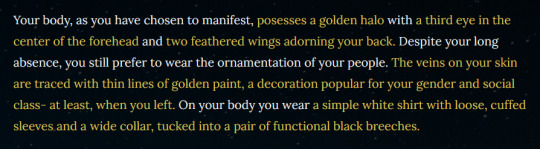
I doodled a possible look for the MC of CH: Foundations, one of the simpler and more “angelic” ones and one which would be met with a positive reception by NPCs. Mostly because I wanted to show you the current character creation section, and because I was in the mood to draw a cute angel instead of a spooky scary skeleton in a dark cloak with moth wings 0.0
Details about the character creation is below the cut!
The paragraph above (which isn’t necessarily the final writing, as it will be naturally meshed in with the story) is actually how you choose aspects of your appearance- the words in gold can be clicked to cycle through different options for each trait. The five categories I’ve mostly settled on are:
Form. This just describes the most significant and interesting “weird” thing about their body, ie. being a skeleton, glowing with radiant light, being smokelike and incorporeal, being very very tall, etc. You can also look like a normal person if you’re boring.
Eyes. Eyes are an extremely important symbol for the MC, their role, their backstory, and their identity in general. The title I call them is literally “The Watcher.” So you can choose how many eyes they have and where, from a not-quite-exhaustive list of options.
Wings. Their ~aesthetic~ tends to draw heavily from angel iconography, so wings are a separate option. You can choose the type of wings they have or the number (these aren’t separate for now because who needs six moth wings when two are already perfect?), or not have any if that’s not your vibe.
Accessory. The different options here are quite flavourful and are meant to convey some interesting ideas about both the MC’s personal history and culture! Examples include veils, sunburst-style crowns, horned headdresses, and these fun veins inspired by late Victorian beauty trends.
Clothes. This option is the least fleshed out at the moment- it includes options for clothes such as the traditional garb of a Seer in their culture, simpler clothing appropriate to their origin, and some outfits that match contemporary or more out of date beauty standards of both Victorian men and women. I’ll be adding more options to this list for sure.
If you think of anything in those categories you’d like to see included or have any ideas, feel free to DM me, comment, or send me an ask with your suggestion! If it doesn’t conflict with the lore or aesthetic (which it probably won’t) I’ll totally include them :)
Once you’re satisfied with these options and move on to the next passage (basically locking them in) the game will calculate, based on your choices, how approachable or intimidating your manifestation is. If you choose to appear to people other than your tether (your human companion) throughout the game this number will be used to determine how they react to your presence. Depending on what you want to accomplish and with whom, you might only be able to do that by freaking somebody out or getting them to trust you- and even when the ultimate result is the same, you’ll still normally get different dialogue leading up to it.
Luckily, because you are merely projecting an image of yourself and not a truly physical being, you can basically change that image on a whim! I’m planning to implement the ability to choose different options from a menu in the sidebar, meaning if you change your mind or want to strategically plan for a scene, you can do that. Or if you just want to swap your fancy headdress for some fancy bracelets.
Character creation doesn’t massively impact the game, especially given that you aren’t a physical being and NPCs will only see you when you choose to be seen. However I also think it’s part of getting the player into the headspace of their character and feeling the aesthetic of the game early on- in that way, it’s pretty damn important!
Also, making your player character a skeleton is fun and I don’t think you can do that in any other IF games! Yay for skeletons!
#crosshollow#crosshollow colorado#ch-foundations#lore#interactive fiction#twine game#text based game#indie game#indie dev#gamedev
47 notes
·
View notes
Text
I had a strange dream last night. This part specifically takes place at the end.
So, I was on my laptop in the dream looking online for a product I bought in a store when I decided to boot up the Spamton Ukagaka made by @zarla-s and @quonit. Well, everything seemed fine until he showed up. Instead of his usual color scheme, he was only colored with various shades of light grey. It faded after a moment, and in the dream I figured "Oh, he was frozen" like in a cartoon. After he went back to normal for the most part, a blue knit hat (one of the ones with the two parts that hang down from the sides) and a blue scarf appeared on him. I thought, "Awe, that's cute," but this is where things took a bad turn.
Well, it turns out, some odd "mini-game" mode had started (this "mode" was conjured by my mind) and I had to make sure I kept him warm by keeping the hat and scarf on him, which, for some odd reason, would reset their positions to the side at seemingly random intervals. It went pretty quick, and I was still multi-tasking at this point, until I realized there was another mechanic I hadn't known about. My laptop's desktop had been covered by a dark blue brick texture which, as it turns out, was an alleyway that overtime would get more "dirty" in a sense and became darker as time passed. I found out a bit late that there was a bucket of, presumably, water and a sponge that I needed to click in order to "clean" the alley. Around this time, something new happened with Spamton. The scarf came partially off, and he had an uncomfortable look on his face with a dull green stain around his mouth and on the scarf, which in the dream I reasoned to be acid. He said something along the lines of, "It's in my mouth!" before he began to shiver. The background during this time had slowly transitioned to his shop's background (sky-blue wall with yellow sun) but it was a bit darker than usual and not pixelated. After a moment, the background began to melt and then it snapped back to normal, though darker, and Spamton just dropped. He was laying on his side, partially facing the screen, his glasses broken in half on the ground, no trace of the lenses and there were sidebars which were crushed into zig-zags. His eyes looked like the greyed-out lenses of his glasses, even though he wasn't wearing them anymore. He just stared. He didn't more or react when I tried to pet him. I was about to double-click to open his menu when I woke up with that sort of anxious stomach-dropped feeling. I think Spamton froze to death in my dream.
3 notes
·
View notes
Text
Responsive Design App Mac

Noun Project
Design App For Mac
Responsive Web Design App Mac
Responsive Design App Mac Desktop
Seashore is an open source image editor that utilizes the Mac OS X’s Cocoa Framework. Responsive design, react native, web dev, mobile app development, tutorial Published at DZone with permission of Gilad David Maayan. See the original article here. Oct 04, 2017 Responsive design support — allowing you to display the same pages differently on devices with different-sized screens — was rudimentary at best; you can swap between desktop and tablet versions, but if you've finished creating one layout, you'll have to start all over from a blank page to create the other.

The Noun Project is the perfect resource for designers that need generic UI/UX icons. They host an enormous collection of well-designed icons for everyday needs, like status icons, media buttons and menu icons. Their macOS app lives in your menu bar, ready to pop down and provide access to the huge array of icons from your desktop. If you pair it with a paid subscription to the Noun Project, you’ll get access to every icon on the site. Free accounts contains a smaller subset of icons.
Sketch
Sketch is a powerful vector editor designed for the web. It’s built to help designers create vector assets for websites and apps. It’s powerful and flexible, with a ton of tools tuned specifically to the needs of UX and UI developers. Stop fighting with Illustrator and check out a better—and cheaper—option.
JPEGMini
JPEGMini is a tool for compression JPGs before sharing them. Like it’s web-based client TinyPNG, it uses image optimization tricks to cut down the file size of large JPGs. The app can also resize images, saving them to a unique destination or overwriting the originals in the process. The Pro version even includes plugins for Lightroom and Photoshop, compressing your images straight out of the gate. If you need to process a ton of photos for your website but don’t want to suck up all your users’ bandwidth in the process, JPEGMini will be a huge help.
LittleIpsum
LittleIpsum is a free menu bar app that generates Lorem ipsum text for use in webpage mockups. It’s cool because it can quickly create text in a variety of lengths, and it’s always at your fingertips. Just click twice to copy a preset Lorem ipusm block of the chosen length to the clipboard, and then paste as normal.
Tower

Tower is a GUI for Git version control. It helps users work with Git by abstracting away the cryptic command line codes, simplifying Git version control while retaining its abilities. Considering how widespread Git is as a version control methodology, having a good client in your tool belt might make your life just a little easier.
Coda
Coda comes from beloved macOS developer Panic, which builds well designed and superbly functional Mac apps for designers and developers. Panic calls Coda “everything you need to hand-code a website, in one beautiful app.” It’s essentially a super-powerful IDE for building websites from scratch, including a powerful text editor, a WebKit-based preview module, and robust file and project management. If you’re looking for an all-in-one tool to help you build websites by hand, this is what you need.

Sublime Text
Sublime Text‘s praise have been sung far and wide across the development landscape. It’s a powerful, flexible text editor with a huge feature set geared specifically towards developers and programmers. It pioneered now-mandatory features like multi-caret editing (write in more than one place at a time!), massive customization and a built-in file manager. For users that need to get down and dirty with code, you couldn’t ask for a better text editor. The only downside is the $70 price tag. For users with shallow pockets, GitHub’s Atom is a free alternative with almost as much power and even greater flexibility.
CodeKit
CodeKit is just about essential for macOS web developers. It speeds up your web development workflow significantly by automatically refreshing browsers every time you save your code, but that’s not all it does. It also complies languages like CoffeeScript, Less, and Sass, and includes cutting edge tools like an auto-prefixer for vendor-specific prefixes and Babel.js for “next-generation” JavaScript. All in all, it makes web development on the Mac a much less tedious process.
FileZilla
FileZilla is a free, open-source FTP clients. You can use it to sync with remote servers using FTP and SFTP. If you’re doing any major web development, you know that an FTP client is a must for updating remote files. If you want a powerful but free alternative to slow or expensive apps, FileZilla fits the bill.
Design App For Mac
Sequel Pro
It’s developer calls Sequel Pro is a “fast, easy-to-use Mac database management application for working with MySQL databases.” It’s by far the most mentioned and most recommended Mac app for working with MySQL, the dominant database language of today. Great for advanced users and beginners alike.
MAMP
If you work on back-end or server-side development, you’ll need to have a functional testing environment on your mac. You can get a lot of the tools you need in one go with MAMP. MAMP stands for My Apache, MySQL, PHP, which are the three software packages it installs on your Mac.
You might also like:
The 20 Best OS X Apps for Designers & Web Developers
Top Mac Designer Apps
4 Alternatives To The MacBook Pro For Designers
Author: Alex Fox
Web Development Tools
Apple has brought its expertise in macOS and iOS development tools to the web. Safari includes Web Inspector, a powerful tool that makes it easy to modify, debug, and optimize a website for peak performance and compatibility on both platforms. And with Responsive Design Mode, you can even preview your webpages for various screen sizes, orientations, and resolutions. To access these tools, enable the Develop menu in Safari’s Advanced preferences.
Web Inspector
Web Inspector is your command center, giving you quick and easy access to the richest set of development tools ever included in a web browser. It helps you inspect all of the resources and activity on a webpage, making development more efficient across macOS, iOS and tvOS. The clean unified design puts each core function in a separate tab, which you can rearrange to fit your workflow. In macOS Sierra, you can discover new ways to debug memory using Timelines and tweak styles using widgets for over 150 of the most common CSS properties.
Elements. View and inspect the elements that make up the DOM of a webpage. The rendered HTML is fully editable on the left and details about the webpage’s nodes, styles, and layers are available in the sidebar on the right.
Network. See a detailed list of all network requests made to load every webpage resource, so you can quickly evaluate the response, status, timing, and more.
Resources. Find every resource of a webpage, including documents, images, scripts, stylesheets, XHRs, and more. You can confirm whether everything was successfully delivered in the format and structure you expect.

Timelines. Understand all the activity that occurs on an open webpage, such as network requests, layout & rendering, JavaScript & events, and memory. Everything is neatly plotted on a timeline or recorded by frame, helping you discover ways to optimize your site.
Responsive Web Design App Mac
Debugger. Use the debugger to help you find the cause of any JavaScript errors on your webpage. You can set break points which allow you to pause script execution and easily observe the data type and value of each variable as it’s defined.
Storage. Find details about the data stored by a webpage such as application cache, cookies, databases, indexed databases, local storage, and session storage.

Console. Type JavaScript commands in the console to interactively debug, modify, and get information about your webpage. You can also see logs, errors, and warnings emitted from a webpage, so you can identify issues fast and resolve them right away.
Responsive Design Mode
Responsive Design App Mac Desktop
Safari has a powerful new interface for designing responsive web experiences. The Responsive Design Mode provides a simple interface for quickly previewing your webpage across various screen sizes, orientations, and resolutions, as well as custom viewports and user agents. You can drag the edges of any window to resize it. In addition, you can click on a device to toggle its orientation, taking it from portrait to landscape and even into Split View on an iPad.
1 note
·
View note
Photo

Customizable and responsive react sidebar library with dropdown menus ☞ https://bit.ly/2XRzvkZ #reactjs #javascript
3 notes
·
View notes
Photo

Customizable and responsive react sidebar library with dropdown menus ☞ https://bit.ly/2XRzvkZ #reactjs #javascript
1 note
·
View note
Photo

Customizable and responsive react sidebar library with dropdown menus ☞ https://bit.ly/2XRzvkZ #reactjs #javascript
1 note
·
View note
Photo

How to Create a Modern Dynamic Sidebar Menu in React ☞ http://bit.ly/35kQ8GQ #reactjs #javascript
1 note
·
View note
Photo

How to Create a Modern Dynamic Sidebar Menu in React ☞ http://bit.ly/35kQ8GQ #reactjs #javascript
1 note
·
View note
Photo

How to Create a Modern Dynamic Sidebar Menu in React ☞ http://bit.ly/34RJ9FY #reactjs #javascript
1 note
·
View note